Adidas Teaser aimed at gaining awareness and interest in the #warupChelsea campaign.
Cadbury Ident
Quick ident for Cadbury, showing a purple ribbon floating through the air and ending in a union jack to symbolise that Cadbury is as british as ever’ which is the strap line, the public have gained confusion surrounding the international take over so this campaign is aimed at reassuring them.
Jack Crossing – Interview!
Recently i had the amazing opportunity to ask British Graphic Designer Jack Crossing a few questions about his life and career. I found him extreamly inspiring and helpful, check out his website for more at http://www.jackcrossing.com

You studied and graduated from Bath Spa University in 2008, what were your next steps? Did you apply for Empire Design straight away?
After graduation I became really proactive, I emailed hundreds of agencies looking for work, sending out mailers of my work. I interned at a few agencies to start with and also freelanced, working with agencies like SEA, YCN and red stone. I actually got my job at empire after the creative director saw my work at the new blood exhibition on old street, I remember getting a phone call from empires managing director asking if I’d like to meet and have a chat. I’d never actually heard of empire so I went along and chatted with a few designers and found out what they did. When I found out it was film posters I became really interested, whilst at university I used to design the lecture posters for our Wednesday talks, so designing film posters seemed like a really interesting thing to do. I did a two week trial and after that I was offered a job and I’ve been here for nearly 5 years now.
Did you always know you wanted to be a Graphic Designer? And why Graphic Design?
I knew I wanted to work in the creative industry for as long as I can remember. My parents both used to work at saatchi and saatchi, so I was always around advertising in one way or another. My dad is actually my biggest influence when I comes to my career choice. He has worked with some amazing clients throughout his career and has always given me the best advice.
Did you always know you wanted to work for Empire?
Like I said before, I was unaware of what empire was when I was at university. I wasn’t even aware of how film posters were made. During my time at bath I used photoshop maybe twice. I was more about screen printing t-shirts for bands and typography really. I remember in my interview for the job here I lied about my knowledge of photoshop as I was desperate to get a job. In my first week if stay behind and watch tutorials on YouTube and buy magazine on photoshop and taught myself how to use it.
Is your work for empire designed solely by you or do you work as part of a team?
The dynamic at empire is a strange one, I’ve never seen anything like it. Every poster I’ve ever had approved has been solely my own design. We work in a team but tend to present our own designs to the client. It’s a very competitive environment, I guess it’s to make us all work harder, though I wish sometimes it felt more collaborative.
Who gave you your first break or who was your first mentor?
My dad helped me out a lot when I was younger, and still does to this day. He would give me advice on the industry and warn me of certain things to look out for. In terms of my first break, that would have to be empire. They gave me my first job and have helped me develop as a designer and an artist.
What is your favourite type of design? And what would you like to do more of?
Since I was young I’ve always been into design for music, album covers, band logos that sort of thing. In my time outside of empire I produce a lot of album covers. It’s something I’d like to do as a full time job one day.
What are your design career goals?
My biggest goal is running my own studio. Not a massive studio, just a few of us, working on fun projects and making work we’re really proud of. That’s an ethos I have, only produce work your really proud of, otherwise there’s no point doing it! I think also to produce memorable work, we live in a ‘throw away’ society where things are so instant and trends are always changing, so to create work that sticks with people for a long time is a goal.
Which of your designs did you enjoy working on the most or was your favourite outcome?
My favourite is probably the astronaut on fire piece. It was an album cover I pitched to a band in Atlanta, they weren’t keen on it so they went with a different design,so I put it on Flickr because I was pleased with it. Over night it gathered a lot of attention, as a result I produced a limited edition print of the artwork, since then it’s been tattooed on someone’s back, been used for an album cover and sold on a t-shirt at urban outfitters, so the result of it being rejected by the band was something I couldn’t have ever imagined!
What is your favourite piece of someone else’s work?
It’s the album cover for Rodger daltry’s solo album ‘ride a rock horse’. It’s such a surreal and well produced cover, and to think it was created before the time of photoshop makes it even better.
Who and what are your main influences?
My fiancée, friends and family are a massive influence, they always encourage me with my work. In terms of artists and designers that inspire me I’d have to say the likes of storm thorgerson, with his surrealist work for some of the biggest bands in the world. I’m also really inspired by modern art, Damien hirst has produced some beautiful work during his career, the scale and size of his work is immense. I went to see his collection at the Tate last year and was blown away at the size of some pieces, it’s the sort of thing that really needs to be seen in the flesh!
What inspires you?
I’m heavily influenced by music and film. I think the two are the greatest form of communication and also it’s something that brings everyone together. Ever since a young age I’ve been interested in album covers and the way the are used to represent and album or single. I get more excited by a well designed album cover than I do anything else.
What would you say the high point of your career has been? Proudest moment?
I think when I won the silver key art award in 2012 for the design of the Martha Marcy may Marlene poster. I had no idea it was even entered into the competition so to hear that I’d won a silver for it was even more of a surprise. I’m normally not one to get involved with awards as I think design and art is something that can’t be judged, as it is something that appeals to different people. So for one person to judge doesn’t make much sense to me, but when I came into work one day and the award was sitting on my desk I was very proud that something I had created was rewarded in a such a way.
Do you have a quote, theory or pearl of wisdom? (maybe something you was told or heard or live by)
I went to a lecture back in 2008 at wolf Olins by Paul smith, the fashion designer. The one thing I took away from that lecture, that has stuck with me to this day, is when he said “only do what makes you happy “. This is something that is easily said than done. But is is something that has stuck with me over the years. The idea of only working on something that makes you happy is an ethos that very few of us will get to live by during our careers. But none the less it’s something that I try to do. 9 times out of 10 a client will come to me and ask for me to create something with complete trust in me having seen My previous work, and this gives me an opportunity to create something that I’m really proud of and encourages me to try new techniques.
Also if there is anything else about yourself or career that you would like to add?
It’s not so much about my career but its just a bit of advice I live by ‘be inspired’. It’s one of the most important things in any creative job, observing things, listening to others and taking everything in. I have stacks of scrap books filled with things I’ve just found in magazines that can inspire me when starting a new project. Being easily inspired makes work fun.


Alfred Leete!
Pretty much every human in the world would have seen Leetes work or a homage to, at some point in there life wether they realised it was him or not. This is a very big statement, and he is one of very few who this can be said about. With this said, considering he worked in the late 1800’s, early 1900’s its fair to say his work is timeless. Some would say before his time yet that would emply he wasn’t successful in his day which wasn’t the case.
Starting his career at the age of just 15 in 1897 the Daily Graphic accepted on of his drawings, making him a paid artist before finishing school. He attended Kingsholme School in Weston-super-Mare and upon finishing in 1899 he moved to London to take a position with a Printer as an artist. He continued to create work regularly for magazines including Tatler, Punch Magazine and Strand Magazine.
His resume doesn’t end there, in the 10’s and 20’s mainly, he worked for an impressive selection of commercial brands, some of which he is most famous for. Rowntrees Chocolates now known for their Fruit Pastels. Bovril and Guinness, in this poster (below) you can see his style forming, his bold type, clearly laid out with a humorous cohesive picture and copy.

He also designed a series of promotional posters for the London Underground formally known as the Underground Railway Company. Here he uses the greyhound dog known as an animal of speed together with the copy ‘The Greyhound of Travel’ to metaphor the speed of the underground. I also think he may have used a greyhound as they are a british past time. Once again he uses sleek lines with a minimal look and selective colour pallet – also british (red, blues,white).

But what Leete is defiantly most famous for and rightly so is his work as a wartime propagandist which includes the ‘Lord Kitchener poster’, which first appeared on the cover of magazine London Opinion on the 5th September 1914. The whole thing demands your attention in every way. Starting with the large red letters.. BRITONS your immediately drawn in..then the photo of Lord Kitchener pointing straight at you, your in the poster at this point you know your the target.. WANTS YOU.. yes he’s defiantly talking to me. One of the reasons I think this has ben so successful is because the next part of the poster could have said anything, it could have asked you to do anything and you would have looked. Not everything would have fit aswel but you still would have wanted to. Obviously the British aspect and it being the army fit perfectly. My favourite part is the selectiveness of it, less is more defiantly apply’s here. The fact that just his head and arm have been used and the ‘wants you’ fits so easy on the eye underneath, the visual hierarchy is on point your eye is led around the page like a tour guide there is no mistaking whats going on with this. A true testimony to a good piece of design is recreation by others, the Americans have adopted there own version with Big Sam also using their countries colours along with many other commerical companies adopting the style.

Tim Allen!
Tim Allen is an English, stop motion animator. Not to be confused with the American Comedy Actor! Animation wasn’t always in his sights, he hadn’t even heard about it until attending an open day, when the lady called for the Animation course he thought to himself, I can do that. He attended the University of Glamorgan and in his last year won a Glammie award for best 3rd year film.
Over his decade in the bussiness he has worked on kids series such as Fireman Sam, El Nombre, Tim burtons Corpse Bride, Creature Comforts, Frankenwheenie.
During his lecture he talked about his experience of the industry, was good to hear about developing yourself and your career. The do’s and don’ts and showed us how he went wrong, things he was told not to do or to work on. Gave a really good insight into real working life and the different situations and building blocks you may come across in the working environment. Went very in detail on his own work, but not just the finished pieces he went through frame by frame some of the things he had to work on, made me think about the detail that goes into something finished, you have to really think about each aspect of the shot. Showed us how things are made, from people acting out the scenes so you can replicate the poses.
Creature comforts taught him a lot about the rules of what you can and can’t do anatomically with the characters mouth. He had worked on dialogue characters before on Corpse bride but this was his first proper talking piece as the kids series work he did was mainly just up and down movements.
On corps bride he learnt a lot about centre of gravity, due to the long thin characters it was easily noticeable if they were off balance. In an audition piece he had to show the characters walk, he got the job yet his centre of gravity was off, the thighs lent backwards, spine was straight yet his pelvis was forward, this is physically impossible for a human. This was a major learning curve for Tim. He said this helped on Frankenweenie as the dogs tail wasn’t working straight away so he was told to think of the tail as an extension of his spine this bringing the centre of gravity back in play.
He has work on TV right now, an easter, Looney Tunes themed advert. It was a small 6-8 person advert for kinder surprise, he preferred this as its more intimate and friendly.

SO-ME!
I really enjoyed my lecture on design hero’s mainly who have worked with music artists on albums and posters etc. As I am currently working on a brief to create a CD 10×10 album cover and extras I found it very useful research. It was inspiring to see how existing artists have developed styles fitting to the band yet keeping there own style. One who stood out for me was SOME an Art Director, who worked for ED BANGER records on all of they’re bands and has even recorded with some. The Parisian’s background is in illustration and I think this is evident in his work. This certainly doesn’t take anything away for his graphic work, looking at this vynal sleeve it could quite easily be all over the place yet it has great composition, the visual hierarchy works as it feels comfortable on the eye even being such a busy visual. It includes illustrations of the band members surrounded by various vinacular typography.

He has worked on many music videos for DJ Mehdi, Kanye West, Kid Cudi, Justice, and MGMT. Kanye West was so annoyed at loosing out on best video to Justice in 2006 that he stormed on stage, later he demanded the creator of the video make one for himself, that person was SOME.

He grew up around the bellepack movement in Paris before world war 1 which developed the culture of the city greatly, this influenced his work. He hasn’t limited himself to the ED BANGER agency, he has shown a collection of posters in a gallery in Toronto. He completed the whole collection in 10 hours after examining the space first. The fact he was even showing in this manor used to be unusual for graphics based work yet is becoming more acceptable. He is also the main director of the clothing company CoolCats showing his work can work through different media, I have seen online his designs have been applied to bottles and bags too.

Vinacular – local voice/dialect…New word.
Peter Chung!
Peter Chung is a Korean animator who attended California school of the arts in the 90’s? Upon leaving there wasn’t a wide variety of jobs or at least styles of jobs, they mainly surrounded Disney or children’s animation there hadn’t been much animation for a different target audience. One of his first jobs was on Rugrats (one of my fav kids shows) but he found too many restrictions in what he could do, there were set guidelines which were expected to follow such as a linear narrative which was easily understandable, there was dialog which also was very limited. I personally think looking back you can see his influence and his struggle for something different in Rugrats, this may just be me but as a child I remember thinking what weird adventures and imaginations the children had. He also worked on children’s animations such as Teenage Mutant Ninga Turtles and Transformers. Chung believes the audience shouldn’t just look at images they should be encouraged to get involved not just ‘follow’ as twitter and social media culture suggests currently. When MTV decided they wanted something a little more ‘bizarre’ for there early morning viewers Peter was at the forefront as a part of ‘Liquid Television’ where he debuted his labour of love, ‘AEON FLUX’! Described by Peter himself as ‘Action without explaination’, AEON FLUX was a feisty brunette vixan, half dressed in leather underwear, armed with an array of weapons which helped her annihilate anyone who stood in her way of completing her mission of killing Trevor Goodchild. The characters did not speak yet emotions, thoughts and even smells were cleverly portrayed without this. His ability to create brilliant perspective enabled him to make people understand you can see things from a different view point. After a while he decided to introduce dialogue but it wasn’t an easy decision, him and his team divulged into extensive research to create the perfect tone of voice which would maintain the characters integrit, who dies in every episode. One of his team described it as ‘Sesame Street on LSD’. Im not a huge fan of animation or fighting seances but there is something about AEON FLUX which entices you in, it sort of schmoozes you.


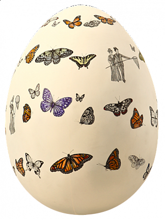
The Lindt Big Egg Hunt – Birmingham!
In Birmingham City center this run up to easter Lindt have collaberated with artist to create The Big Egg Hunt 2013 which showcases a number of decorated eggs roughly around a meter in height placed around the centre which children can use a map to find. These are also being exhibited in other cities around the uk and in support of Action for Children.
Some of these eggs aren’t just drawing/paintings but have indents and bits coming out too. My particular favourite is this butterfly illustrated egg by Rreannon Ormond as it resembles Damien Hurts Butterflies in which he has placed thousands of dead butterflies carefully into an intricate pattern. I saw this piece at the Tate Modern last year it is quite breathtaking up close the detail of these natural creatures is amazing.

This is Birminghan 2012 By James O’Hanlan, enamel on aluminium, which is currently being shown in the Birmingham Museum of Art also had a likening to another egg by Lindsey Spinks.

Erik Spiekermann! – Information Design.
The 7 Key principles of Information Design which should be considered when thinking about information design or any design for that matter are:
Grouping information – Lines/Space/Type.
Consistency – Language/Layout.
Typography – Audience/Message/legibility.
Grid Structure – Clear/Consistent/Navigation.
Graphic Elements – Bullet Points/Icons/Lines/Rules.
Spacing – Alignment/Consistency/White Space.
Visual Hierachy – Type Size & Weight/Colour/Lines/Space.
Erik Spiekermann
Erik Spiekerman is a German Typographer and designer who has created many widely used Fonts, best known for his typeface ‘FF Meta’ which can be seen in all its forms on this site: http://www.myfonts.com/fonts/fontfont/ff-meta/

Starting off as freelance grahpic designer in London, before returning home to Berlin to co-founder
MetaDesign. He later left MetaDesign due to disagreements. In 1989, along with his wife, he created FontShop. Later in his career he started what is now Edenspiekermann, which is still in oractice. Over the years he has developed work for many people and corperations such as Düsseldorf Airport, Audi, Volkswagen and Heidelberg Printing.
I visited the Edenspiekermann website but found his blog much more informative and enjoyable to browse, he writes his opinion and thoughts aswel as factual entries.

Spiekermann is a very influential deisgner, especially in the typograghy field winning awards throguht his career and doesnt show signs of stopping having recently won his fourth lifetime atcheivment award from the German Design Council. Of the type ive seen of his, it seems very structured and sort of formal. I haven’t yet discovered very pictoral or extravagant type which I think intrests me the most, yet his type is very useable. Id like to know a lot more about type than I do therefore studing Spiekermann’s work is a great place to start.
Follow Me!
![]()